Songride Beta available for testing
·About 3 years ago I made a little mashup using Ruby, Google Charts API and the Last.fm API and a bit of magic that listed you from where your favorite artist were coming from. As an example this was the chart output for my favorite artists:

As it became more and more popular I changed it to a C++ CGI implementation to support the increasing number of requests. After some while I moved to a new server which had more power but still was utilised upto 50% just from this one application. Because of that I decided to only continue to host the pages that generated the image URLs but not those that gave you access to them so that the old images still worked but that there will be no more increase in popularity so that it would consume my whole server (this was a very sad decision).
I continously worked on different solutions in various languages and now ended up with a new version using NodeJS, Redis, MongoDB and CoffeeScript in the backend which is now ready for early testing.
Just visit: http://xhochy.com:3000/stats
Instead of my own heuristic it now relies on The EchoNest for the mapping Artist -> Country. As it is still a beta you should expect the URL to be moved in some time. At the moment there are only 2 types of visualization which are fully generated by JavaScript. For the future I may add a bar chart and the ability to include some of those graphs in yor Last.fm profile.
Want to help? Fork the songride GitHub repository
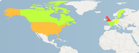
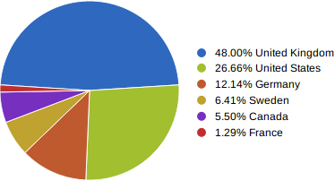
If you are very curious, here are the both visualizations for my TOP 50 artists:
Pie Chart (preview):
World Heatmap (preview):